Gigawatt
I led the development and implementation of a full design system, named Gigawatt, for Easy PV, a web-based solar design platform for domestic to large-scale installations, used across the UK and Ireland to plan, cost and document photovoltaic systems. The product had scaled quickly without any design foundation, resulting in inconsistency and friction. My work brought visual clarity, UX consistency and long-term maintainability to a platform used by thousands of installers and engineers daily.

Context & Problem
Easy PV is a comprehensive solar design tool used by sales teams, engineers and installation companies to spec and design PV systems, generate compliance documents, estimate costs and quote homeowners for system builds. Despite its technical capabilities, the UI had grown organically – built almost entirely by engineers and without any dedicated designers.
By the time I joined the team, Easy PV was supporting projects ranging from small domestic arrays to industrial-scale multi-megawatt systems, but the interface was increasingly difficult to use and maintain:
- Inconsistent UI elements confused users and slowed onboarding
- Developers were re-creating components manually, leading to bugs and styling drift
- There was no central source of truth for spacing, colours or patterns
Easy PV was a well-used product in a critical infrastructure space. Fixing the design deficit wasn’t just a visual upgrade – it was essential for scalability, reliability and user trust.
Research
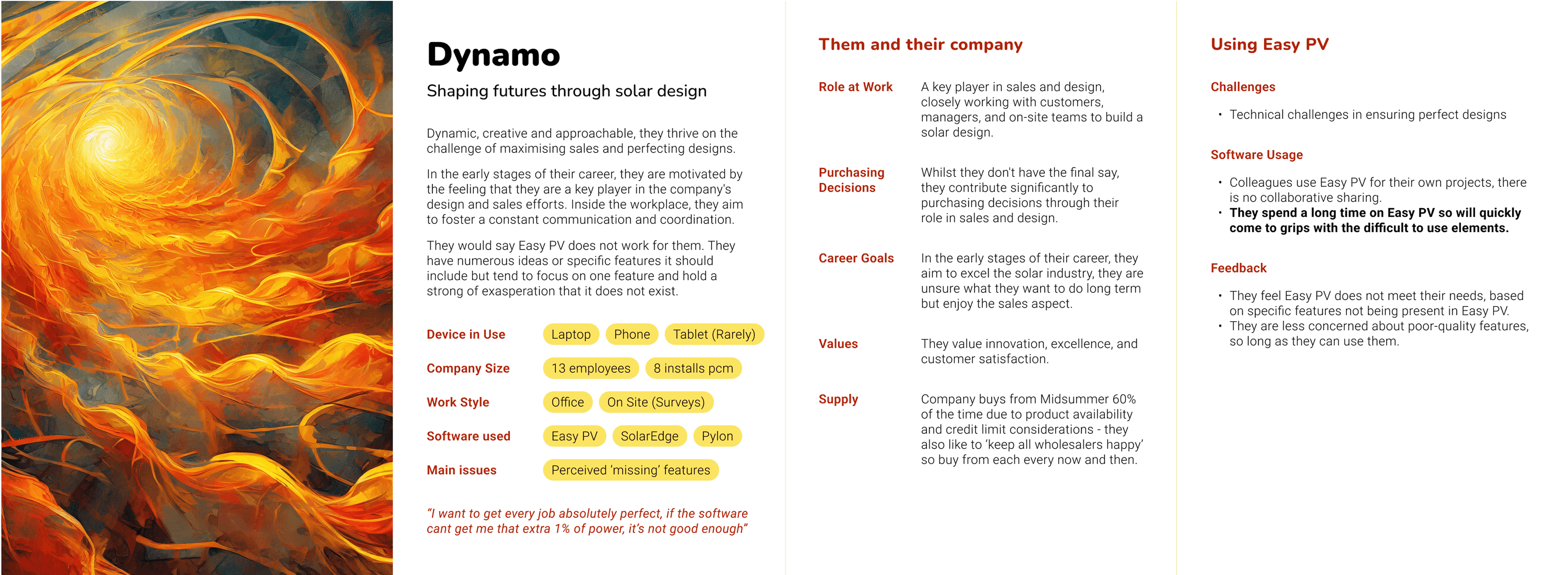
I ran a focus group with internal stakeholders to define key design principles (Easy, Friendly, and Comprehensive) and understand product goals. To ground the system in real usage, I conducted interviews with installers at a solar trade event and developed three core personas. These captured user environments, workflows and pain points.
Goals
- Introduce a unified visual system and defined interaction methods across the platform
- Streamline development through reusable components and tokens
- Improve UX consistency, especially in extensive and technical workflows
- Reduce design ambiguity and UI-related bugs
- Lay the foundation for future design hires and documentation
- Ensure the system reflected Easy PV’s core brand values of being approachable, professional and comprehensive – supporting both technical and non-technical users
Process
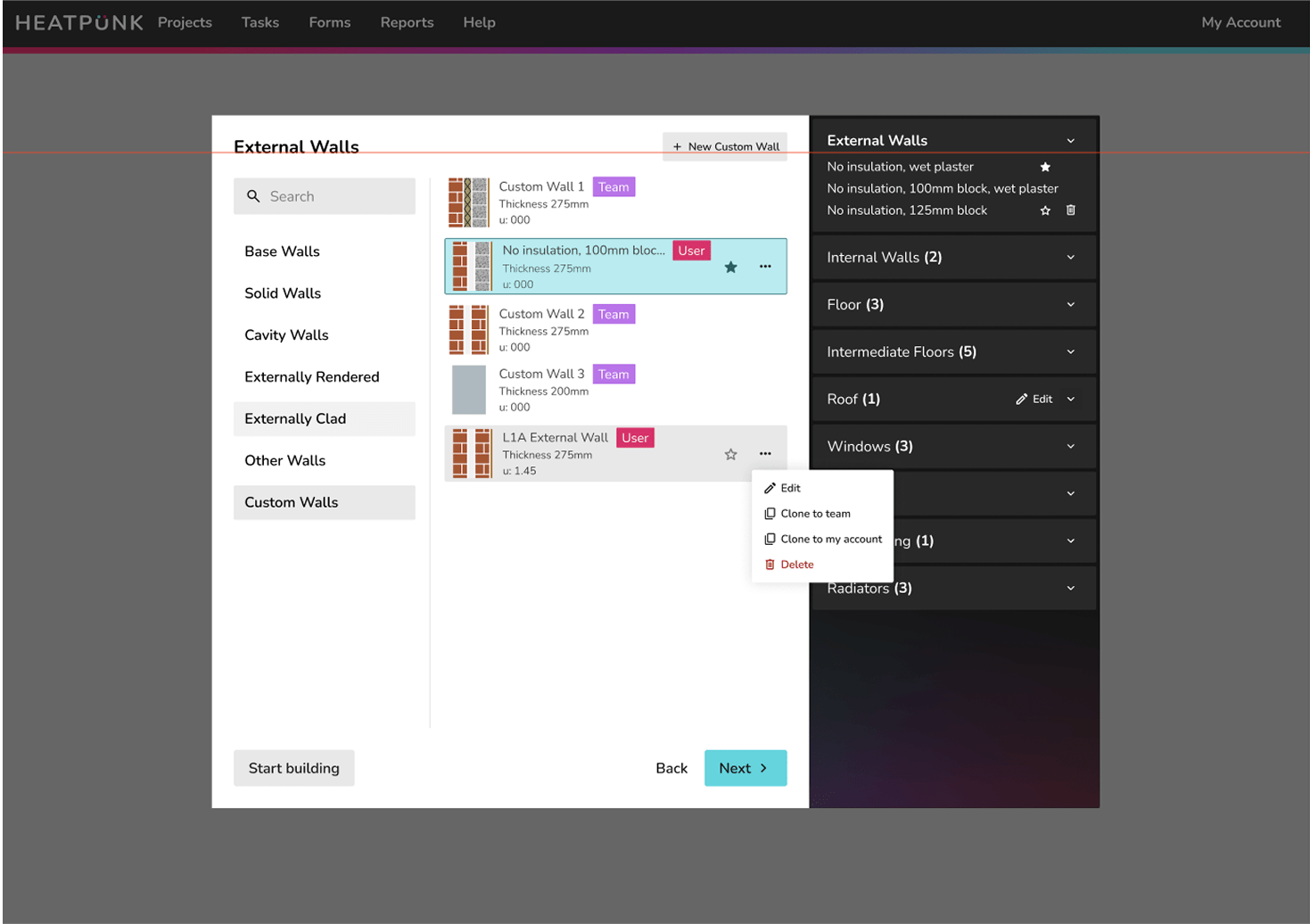
1. UI Audit & Pattern Inventory
I reviewed every screen in the product, cataloguing all visual inconsistencies and repeated components, including dozens of near-identical button styles. I found an inconsistent use of system components and a complete lack of any spacing or structural systems.
2. Foundation Design
I defined a new visual language for Easy PV:
- Set a consistent type scale and modular spacing system
- Created iconography rules and updated key status indicators
- Defined consistent breakpoints for responsive design
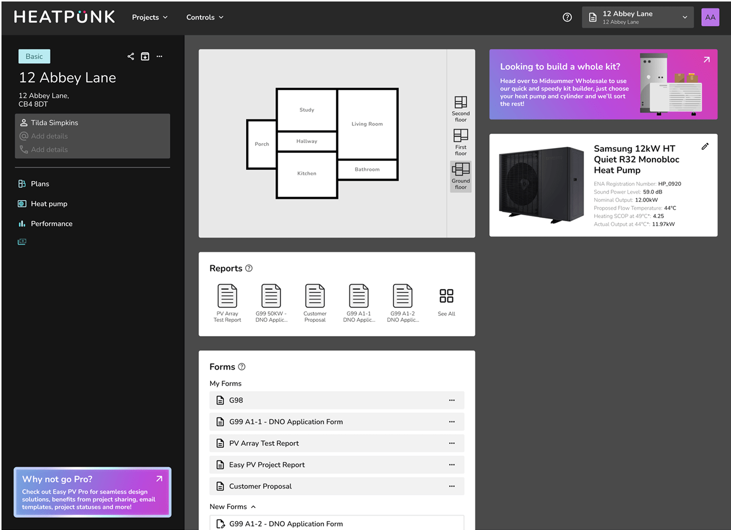
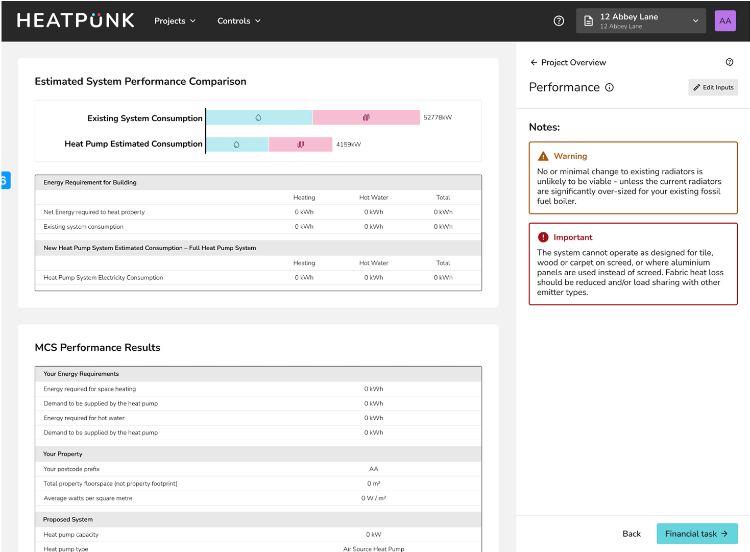
Gigawatt was also designed for Heatpunk, Easy PV's more formal sister product. The system includes flexible tokens, such as variable colour palettes and border radii, to allow each product to maintain a distinct visual voice while sharing the same structural foundations.
3. Component Library
Working closely with engineers, I designed and documented a comprehensive set of components in Figma: buttons, inputs, dropdowns, tables, tooltips, and more. Each was built with accessibility and real-world edge cases in mind.
Components were versioned and synced with development via a shared token system. I wrote detailed usage guidelines to reduce ambiguity and ensure alignment across design and code.
To accelerate adoption, I also developed basic HTML/CSS prototypes for key components. This helped bridge the gap between design and engineering, especially given the team’s lack of prior design collaboration experience.
4. Gradual Rollout
We integrated the system incrementally into the live product. I prioritized high-traffic pages and new features first, then worked backwards to refactor legacy sections without delaying the general development roadmap.
Challenges
- Getting early buy-in from developers who had never worked with a design system
- Balancing ideal UX designs with the technical limitations of the existing codebase
- Avoiding perfectionism – shipping a useful v1 quickly and improving over time
- Ensuring accessibility and clarity for a wide range of users, from tech-savvy engineers to admin staff
Impact
- Reduced developer time spent on UI work
- Cut visual and interaction inconsistencies
- Enabled faster onboarding of new developers through shared design documentation
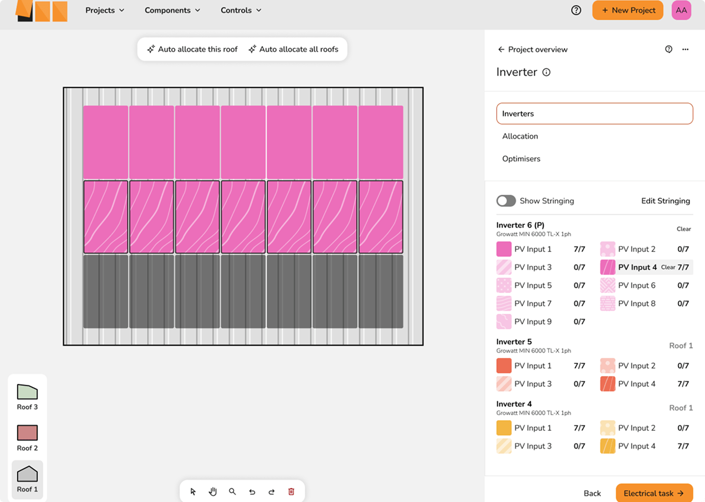
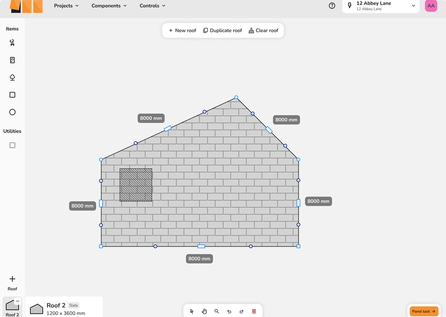
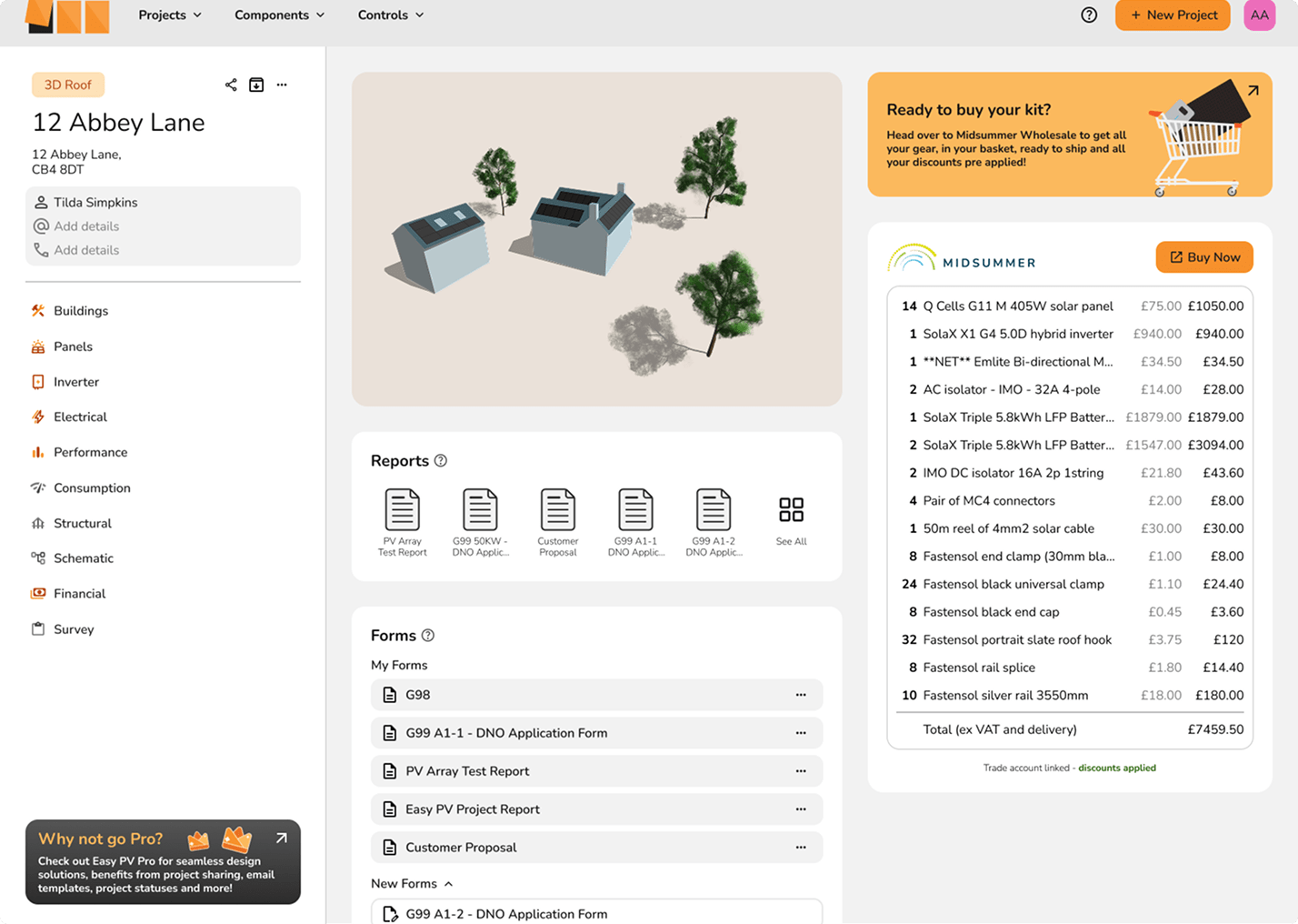
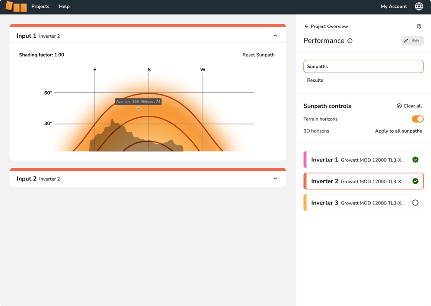
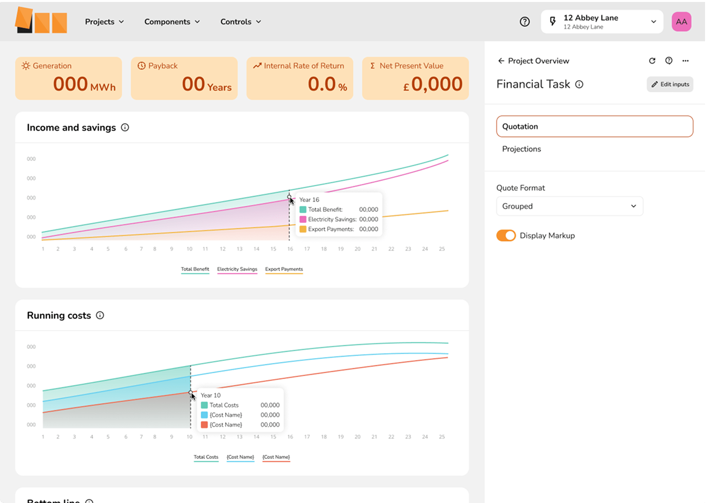
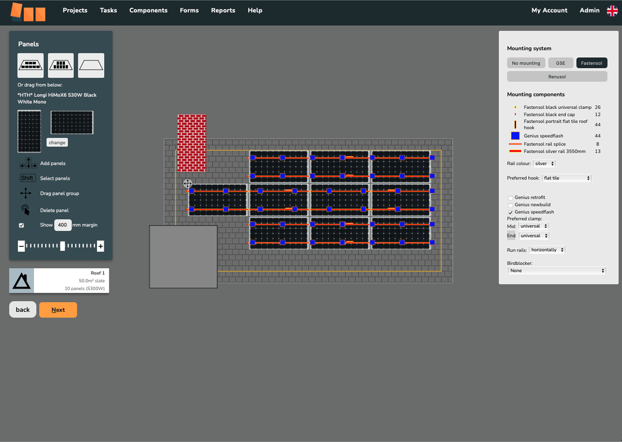
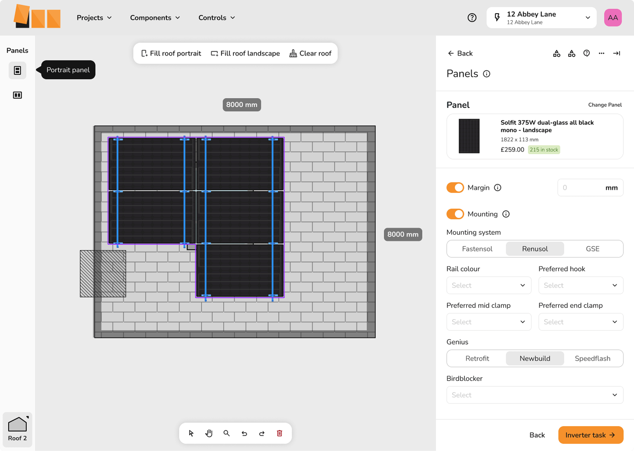
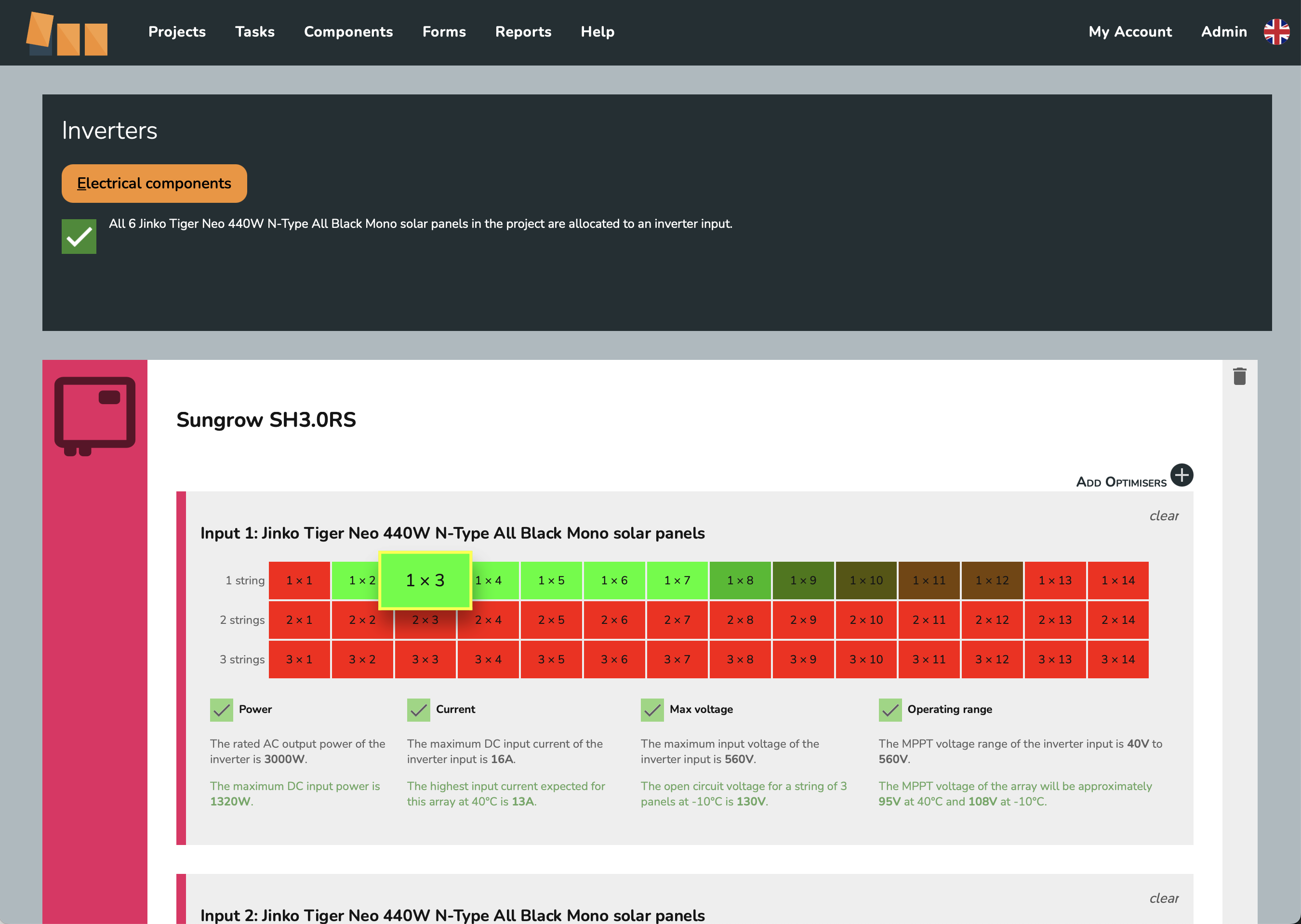
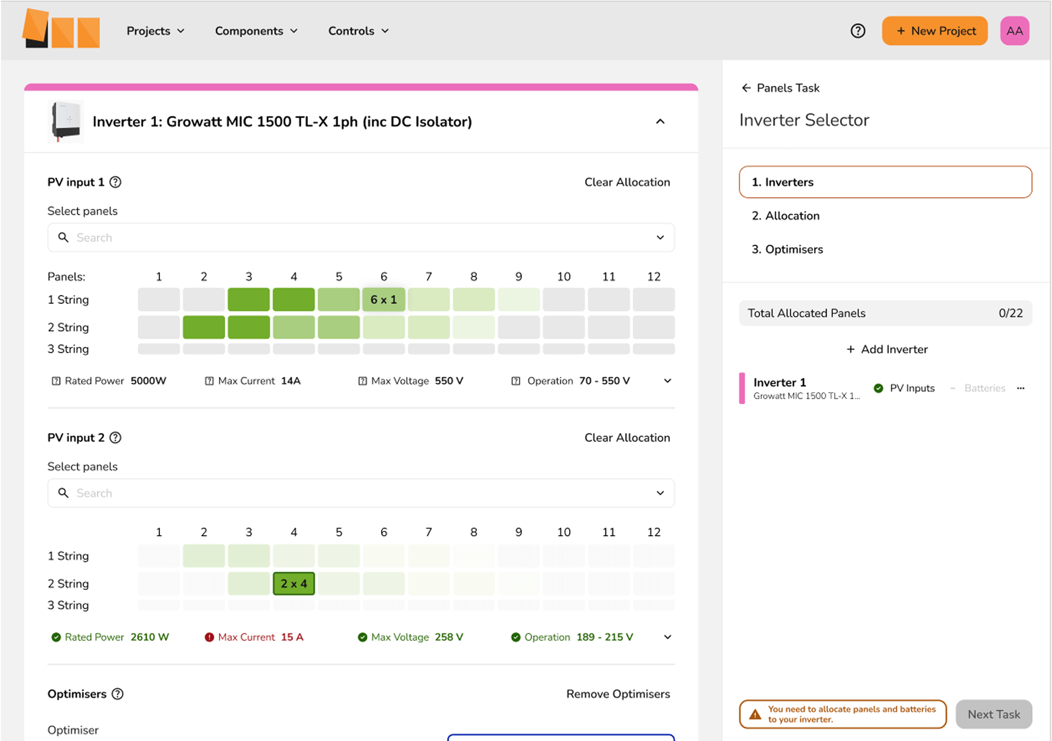
- Improved visual clarity and usability for core workflows, including roof mapping, documentation management, and solar mapping/inverter allocation.
Reflection
This project deepened my belief that good design isn’t surface-level – it’s a structural investment. I learned how to deliver design value in a highly technical product space, balancing clean visuals with functional depth. It also reinforced the value I place in field research. Talking directly to users helped me shape a system that worked for both engineers and admin staff. If I were to do it again, I’d integrate more regular user validation early on.
Tools
Figma, HTML, CSS