Midsummer
In 2025, Midsummer, a leading UK renewable energy wholesaler, asked me to modernise their visual identity and redesign their online shop. The existing site had strong customer loyalty and brand recognition, but it lacked clarity, structure, and modern functionality. My goal was to evolve the brand without losing its roots and to make the shopping experience easier and more intuitive for trade customers.
Context & Problem
Midsummer supplies solar panels, inverters, heat pumps, and other renewable goods to installers across the UK. Their site had grown over time into a powerful tool, but it was showing its age: visually inconsistent, hard to navigate, and out of sync with user expectations shaped by modern e-commerce platforms.
The scope included:
- Refreshing and defining the brand identity
- Improving product discoverability and search
- Reworking information architecture
- Modernising the visual interface while keeping the existing backend structure largely intact
Resources were limited, so the redesign needed to work within those constraints — solving the biggest usability problems without rebuilding the entire structure of the platform.
Goals
- Update the Midsummer brand without losing recognition or trust
- Improve product search and navigation to reduce user struggles
- Make stock availability and product context more visible and consistent across listings
- Increase usability for both external installers and internal sales teams
- Deliver a design solution flexible enough to evolve over time
Research
I started with internal workshops and a brand audit, identifying key assets worth keeping, like the iconic sunpath within the logo, while also uncovering weaknesses in consistency, scalability, and visual impact.
On the site side, I ran focus groups with internal sales staff who support customers daily. Their insight was critical — not just as users, but as interpreters of user pain. We also surveyed customers to understand how they shop on other platforms. Key takeaways included:
- Users expect a strong global search and prominent filtering tools
- Stock visibility is crucial but often hidden or unclear
- Navigation was inconsistent and caused confusion
- Customers frequently missed key products due to unclear categorisation
All findings were synthesised through affinity mapping and prioritised based on impact and feasibility.
Brand Redesign
The brand refresh aimed to balance continuity with clarity. I worked closely with the marketing team to explore directions that retained the visual identity but improved legibility and adaptability.
Process:
- Conducted a brand audit: logo sizing, type weight, colour contrast issues
- Created brand boards showcasing how refreshed assets would work in practice
- Iterated on multiple logo directions incorporating the sunpath concept — a visual link to the company name and solar focus
- Presented final proposals to the Midsummer board, who selected a direction combining clarity, heritage, and modernity
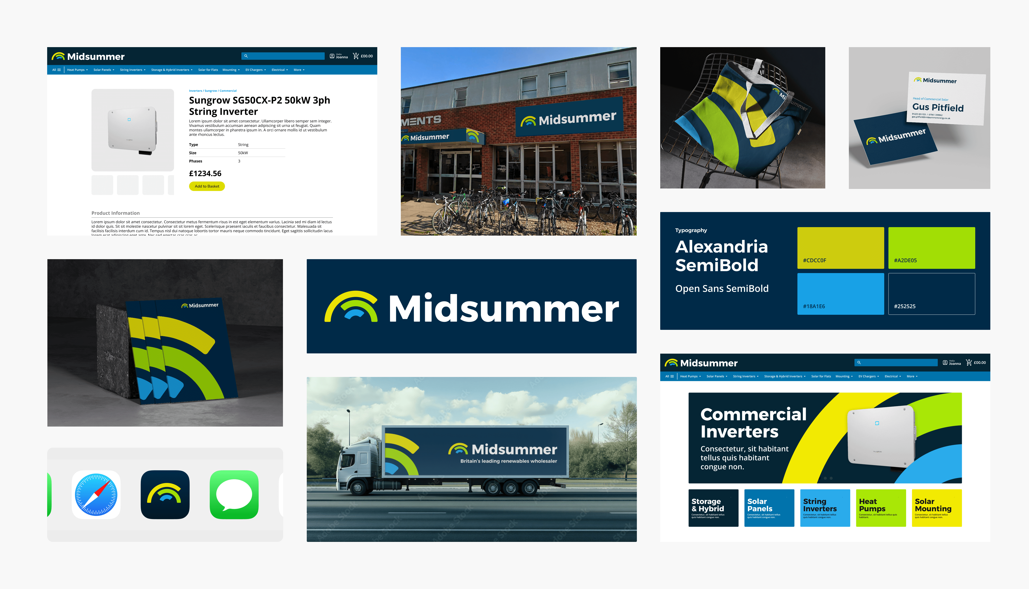
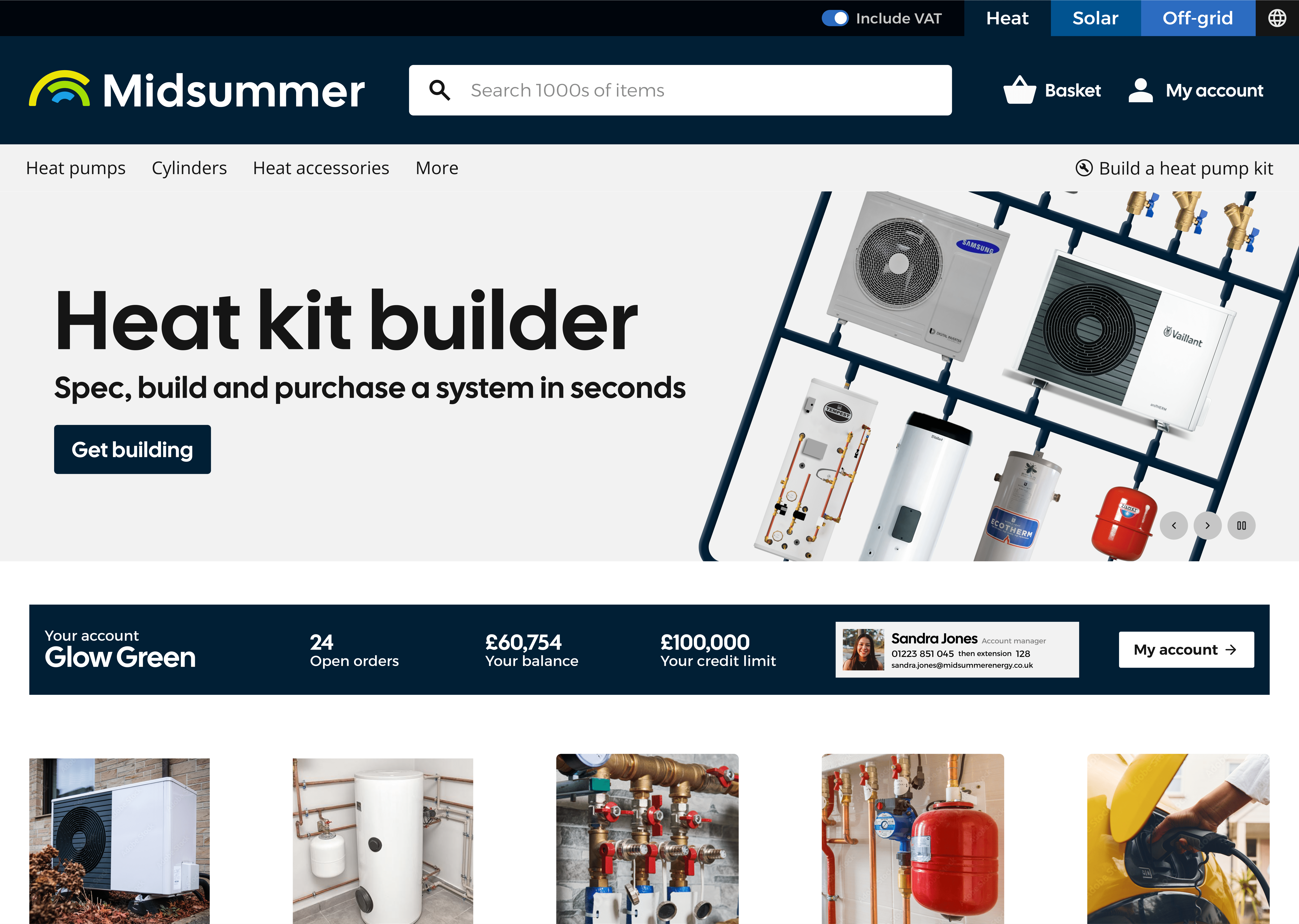
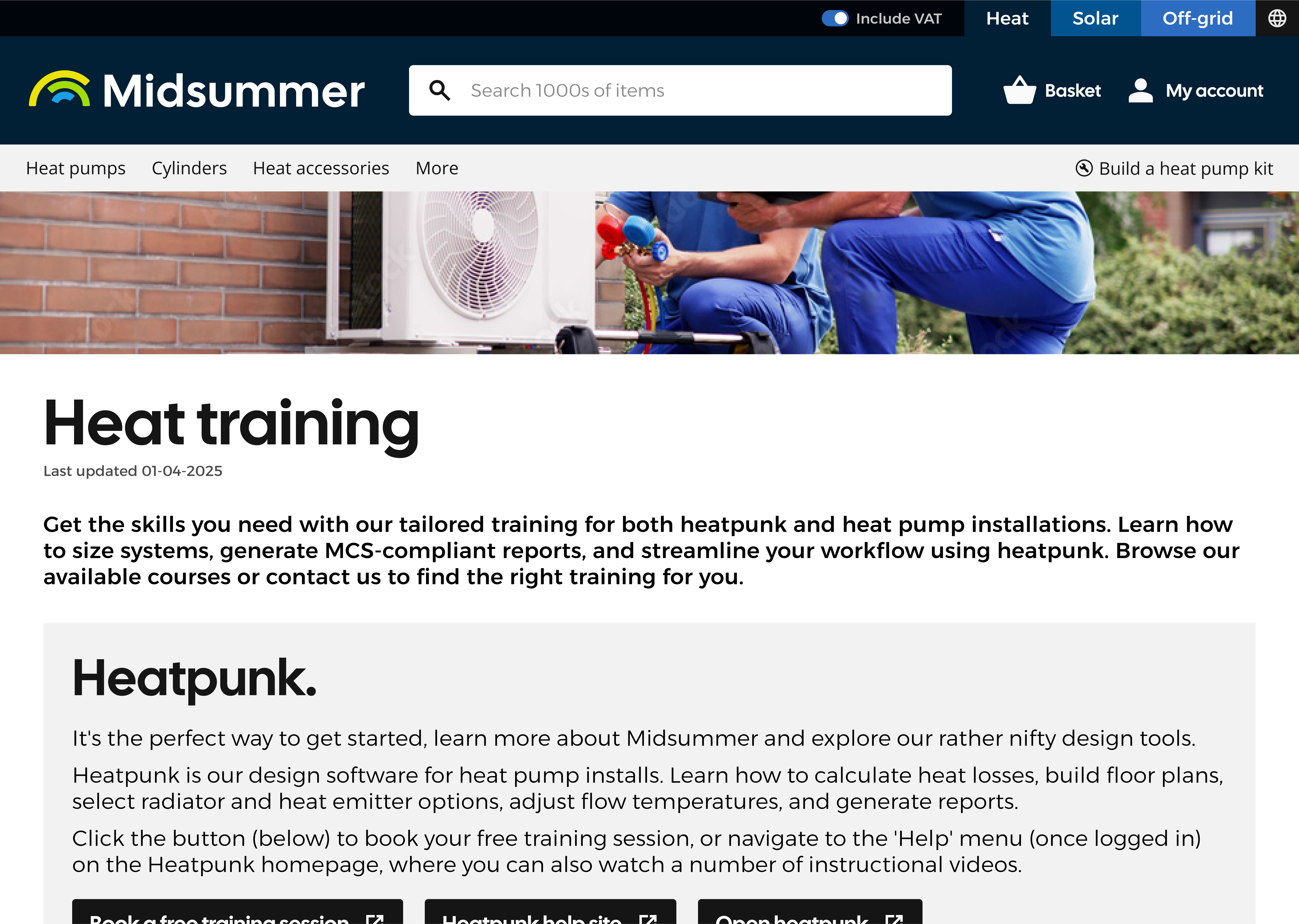
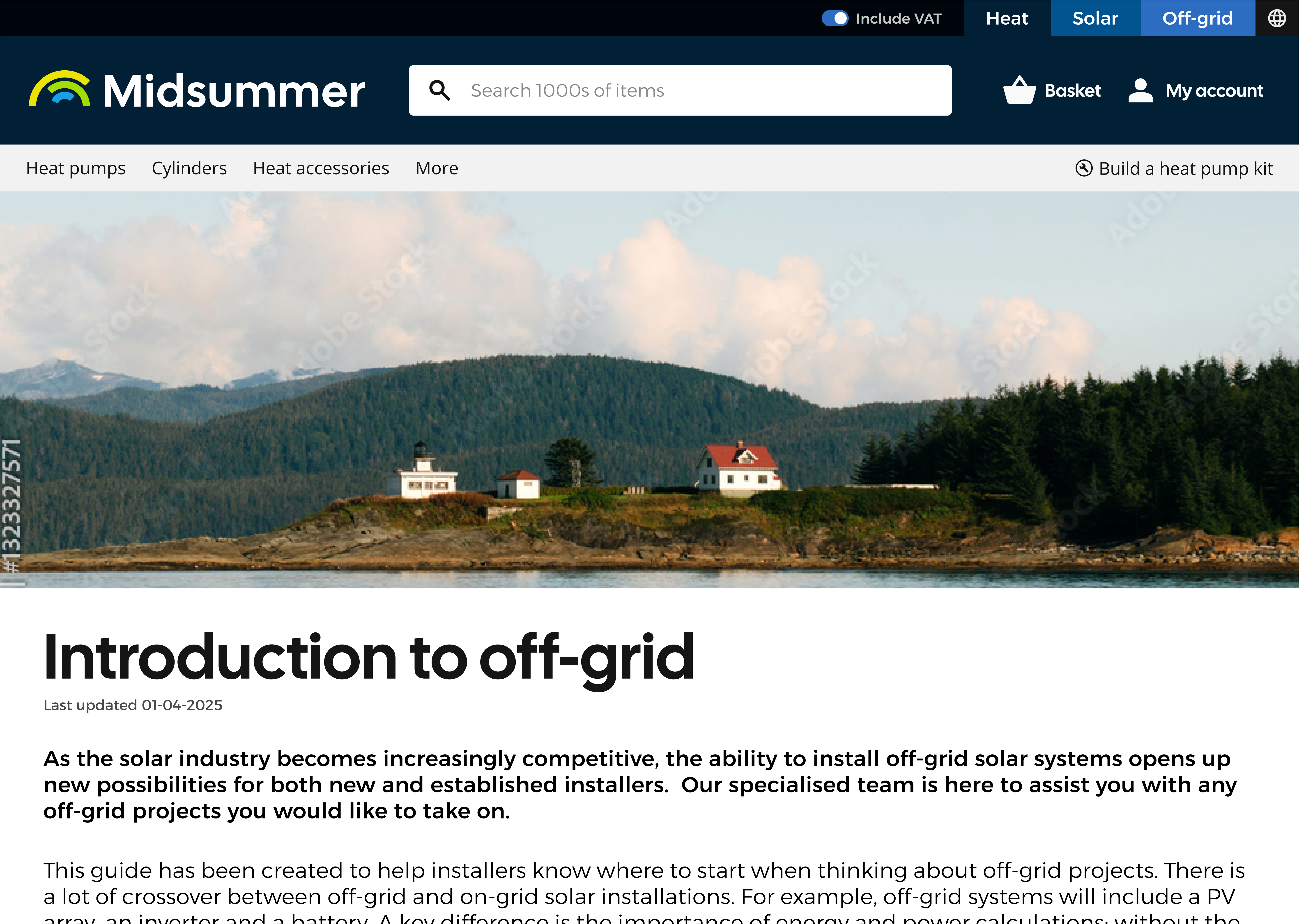
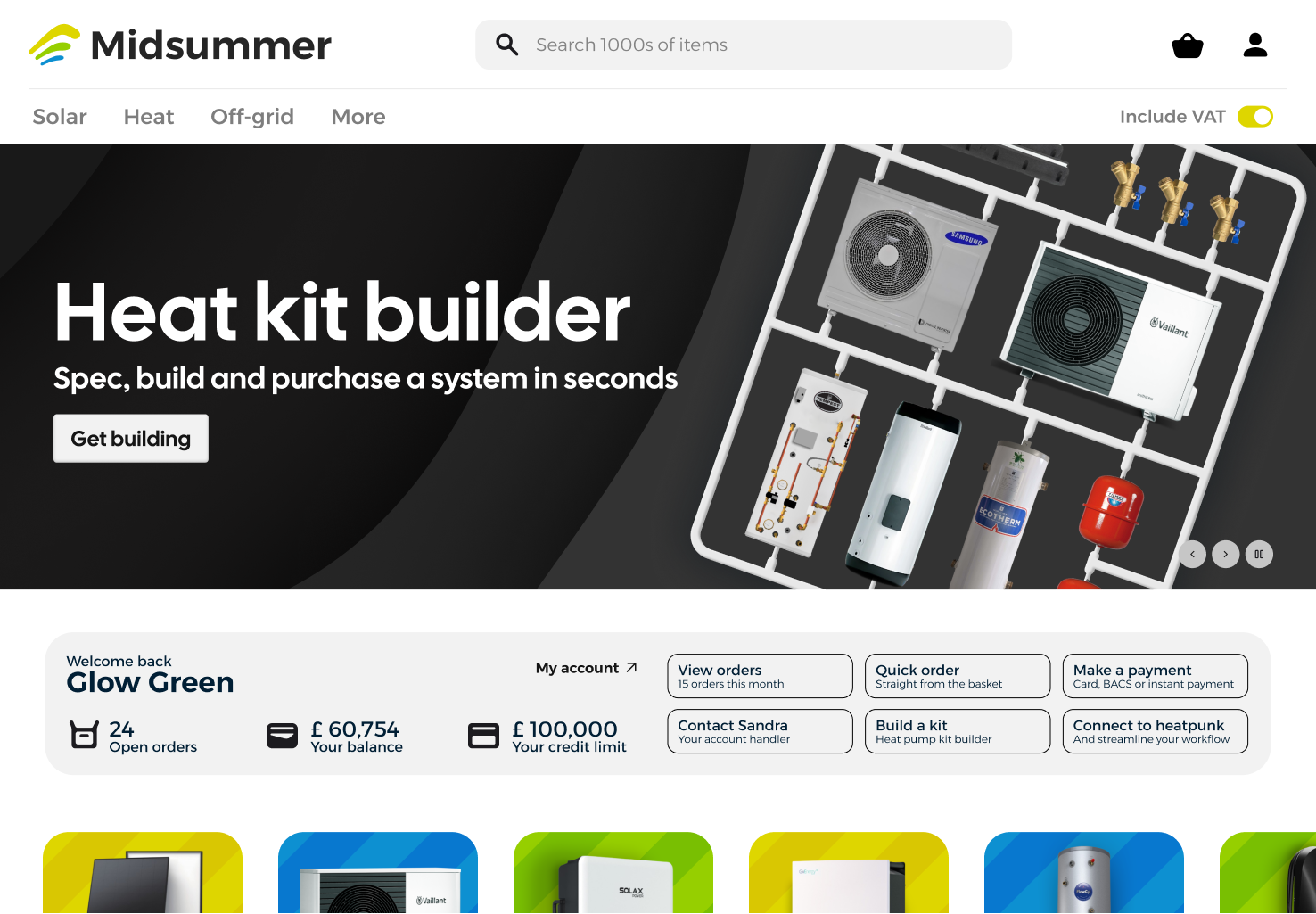
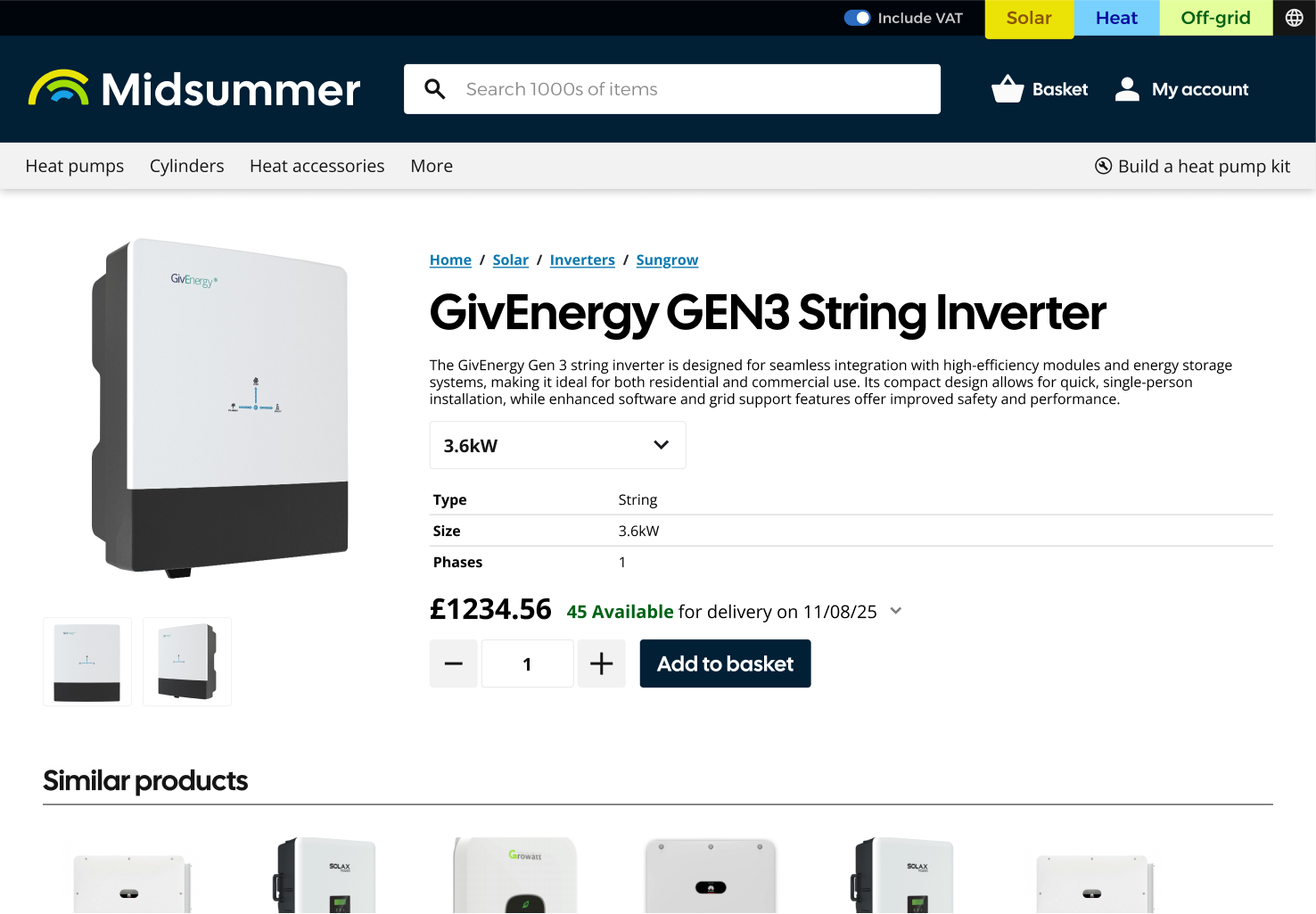
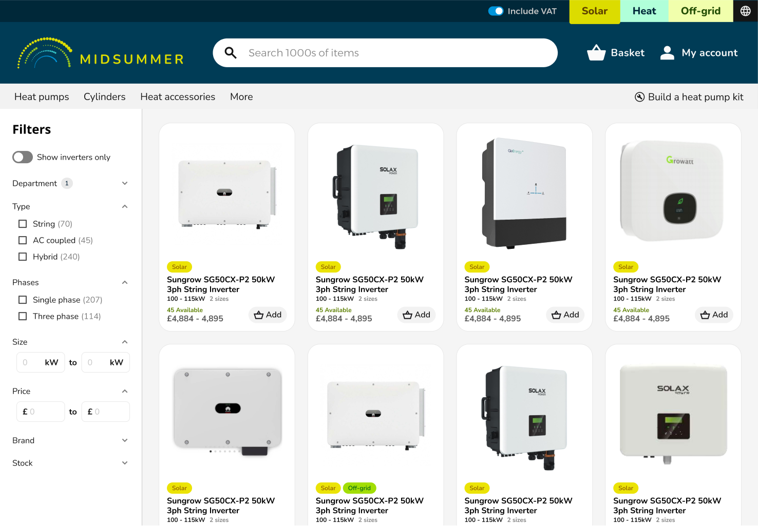
Shop Site Redesign
The site redesign was shaped by user needs and technical constraints. Working with existing backend limitations, I focused on improving the UI and UX through thoughtful layout, smarter structure, and better prioritisation of key content.
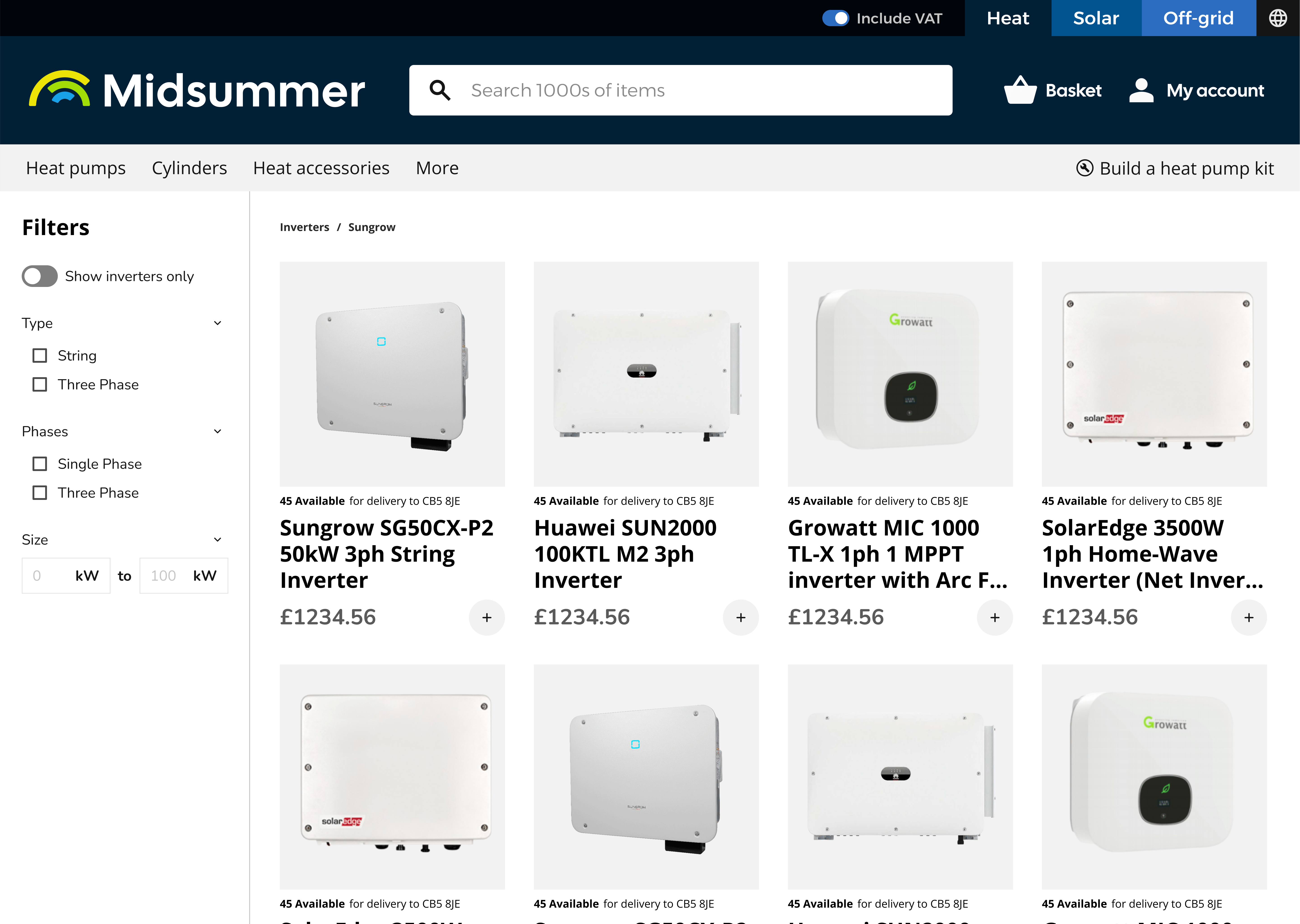
Key changes included:
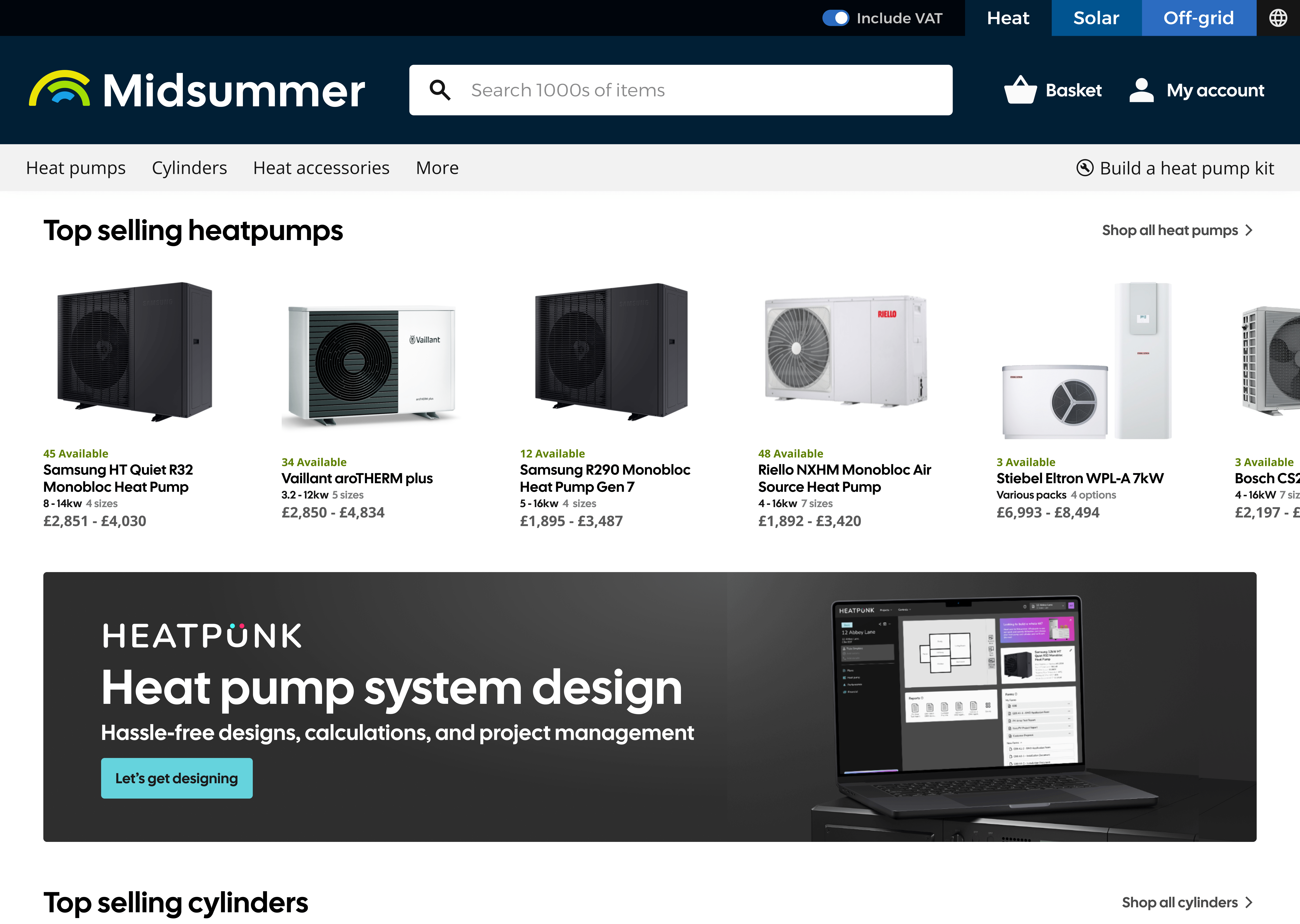
- Replacing side navigation with top navigation to improve manual searching
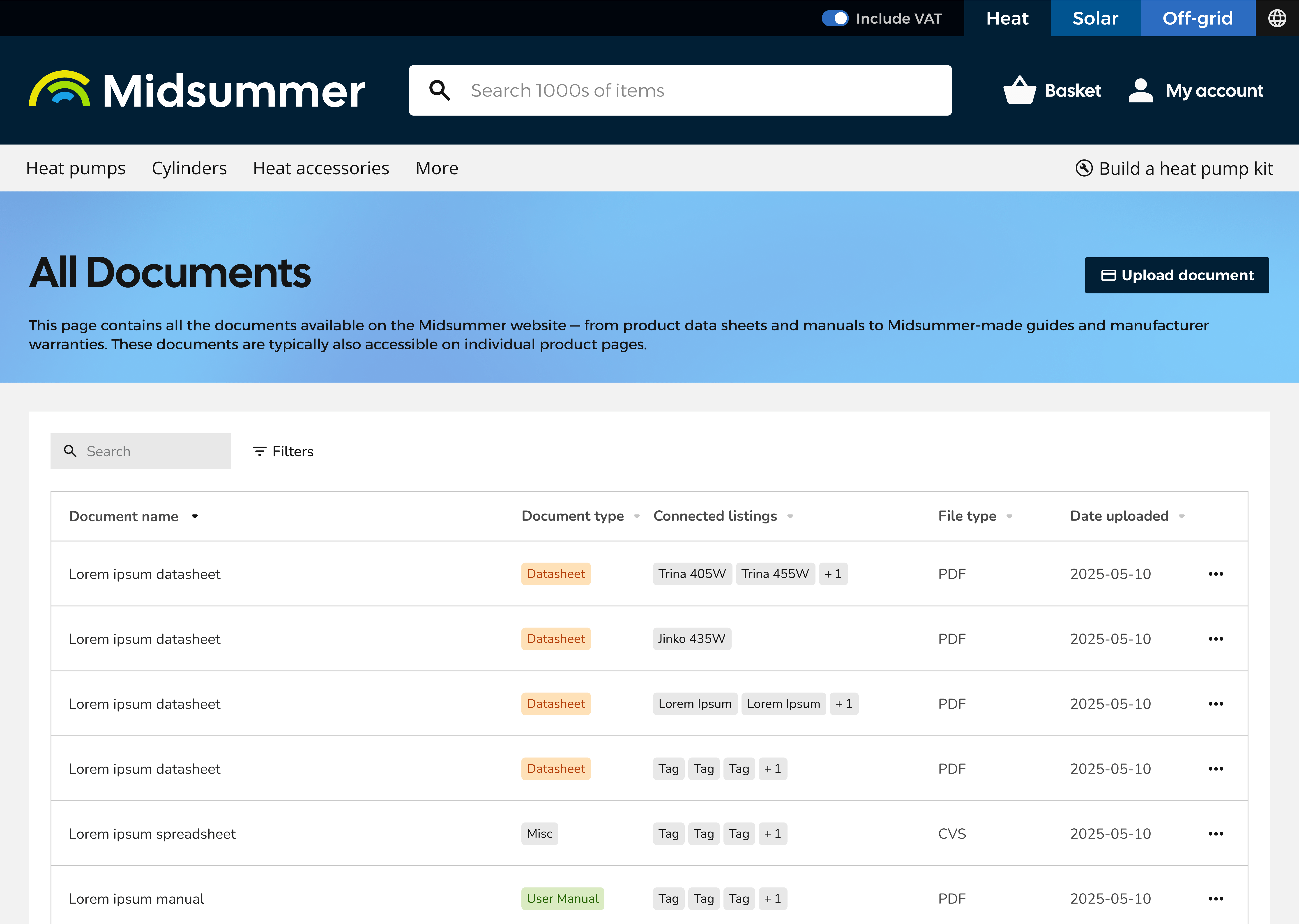
- Designing a persistent, smarter search with clearer filters
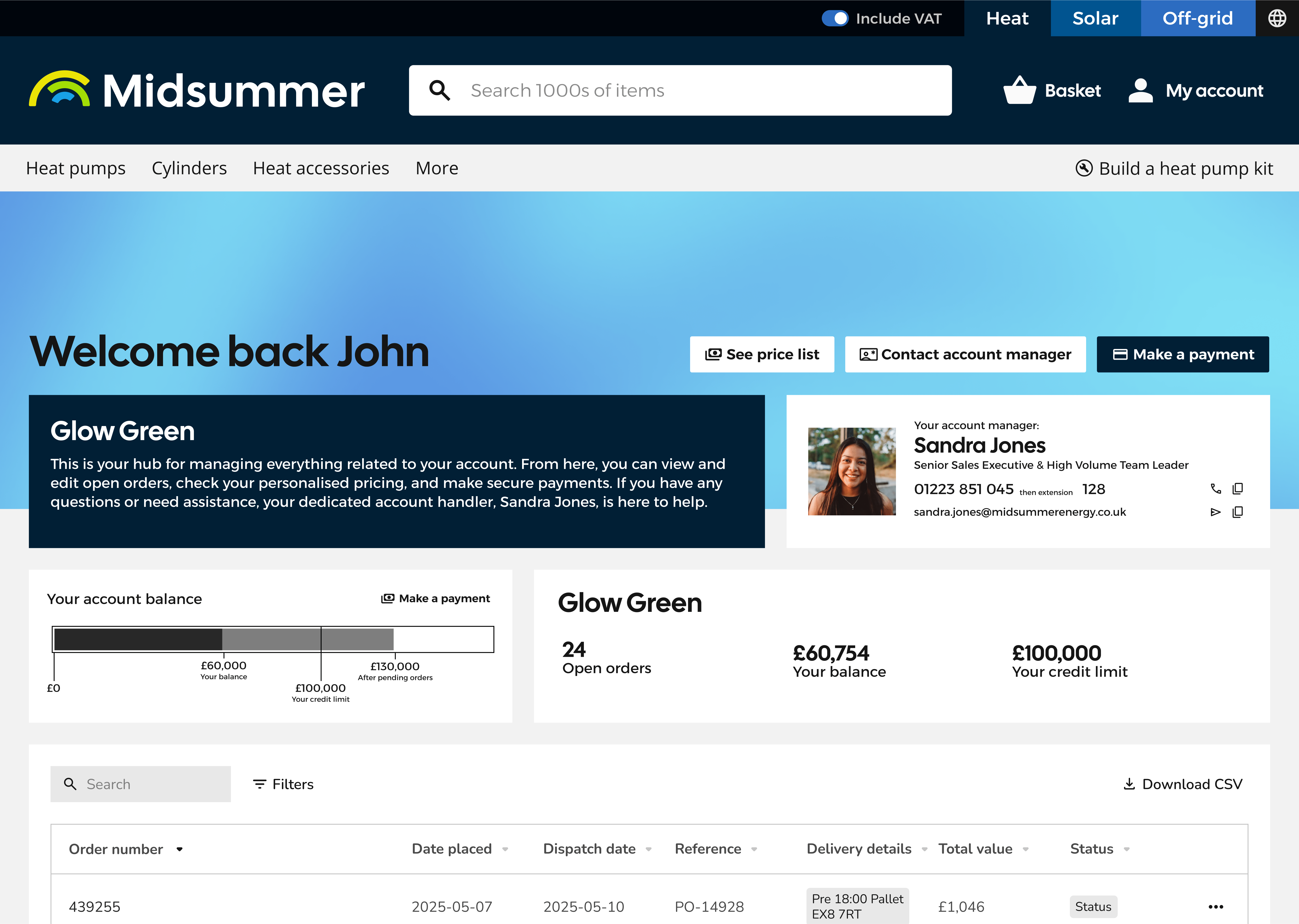
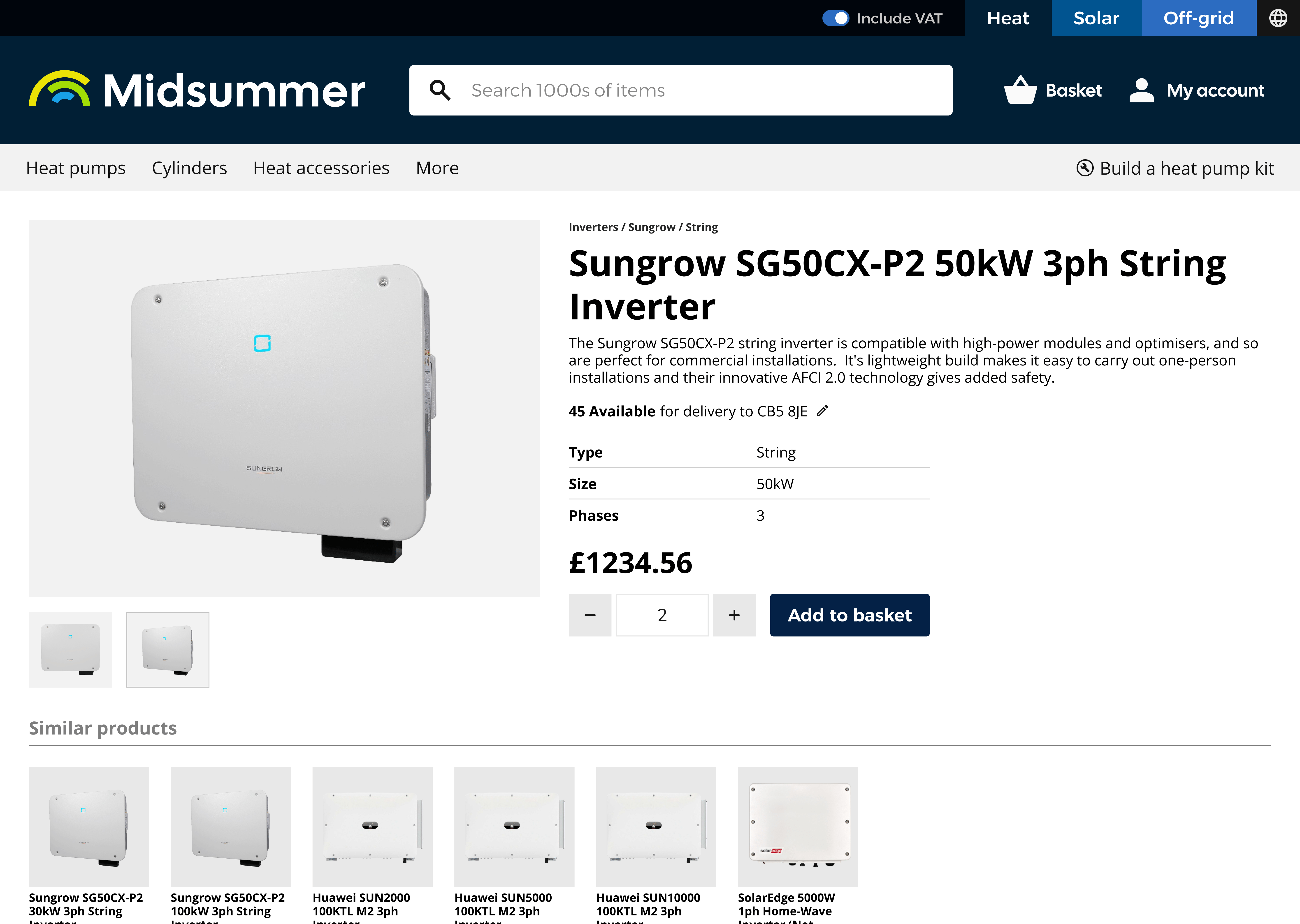
- Surfacing stock data in listing cards and improving its visibility
- Redesigning product bundling for both internal and external clarity
- Bringing account handler contact details within easy reach
Implementation & Handoff
The final proposals for this project outlined three alternative brand directions, each exploring how the chosen approach could shape the new site design, two considered new brand directions, one explored how the existing branding could be developed further. Key pain points and issues identified through research were addressed in different ways, enabling a thorough discussion of which solutions were both practical and effective, as well as which visual language and branding best aligned with the company’s direction.
The project was then placed on temporary hold to allow other factors, such as developer resources and marketing availability, to align with the scope required for implementation.
Reflection
This project showed how much brand and UX can intersect — particularly in a B2B context, where clarity and trust directly affect customer decisions. Working within structural constraints sharpened my prioritisation and problem-solving skills. If revisiting, I’d explore testing navigation variants earlier with real customers, and push harder for long-term investment in scalable component architecture.
Tools
Figma, HTML/CSS, stakeholder interviews, surveys, affinity mapping